COLLECTING, ORGANIZING AND DISPLAYING DATA
Day 1 OBTAINING INFORMATION FROM GRAPHS
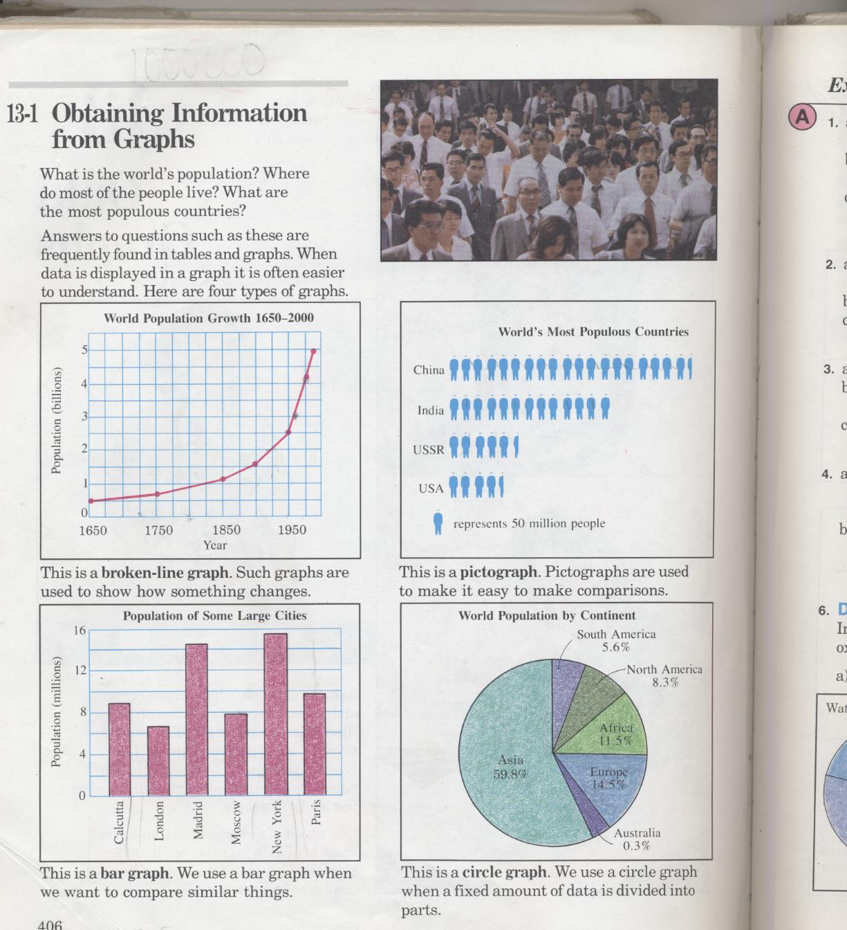
Graphs can be used to visually represent the relationship of data. It can help organize and show people statistics, which can be good for some and not so good for others, depending on what the statistics show. Organizing data graphically can come in handy in fields like business, sports, teaching, politics, advertising, etc.. We see graphs in the newspapers, magazines, and on television because they help us to communicate information. Many different types of graphs exist, and each has something different about it that makes it useful in a unique way. In this unit we will look at how information is collected, organized and displayed.
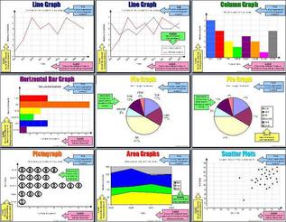
Today students reviewed the skill of interpreting information from graphs. They were provided with the following activity sheets to complete in class/home:
Today students reviewed the skill of interpreting information from graphs. They were provided with the following activity sheets to complete in class/home:
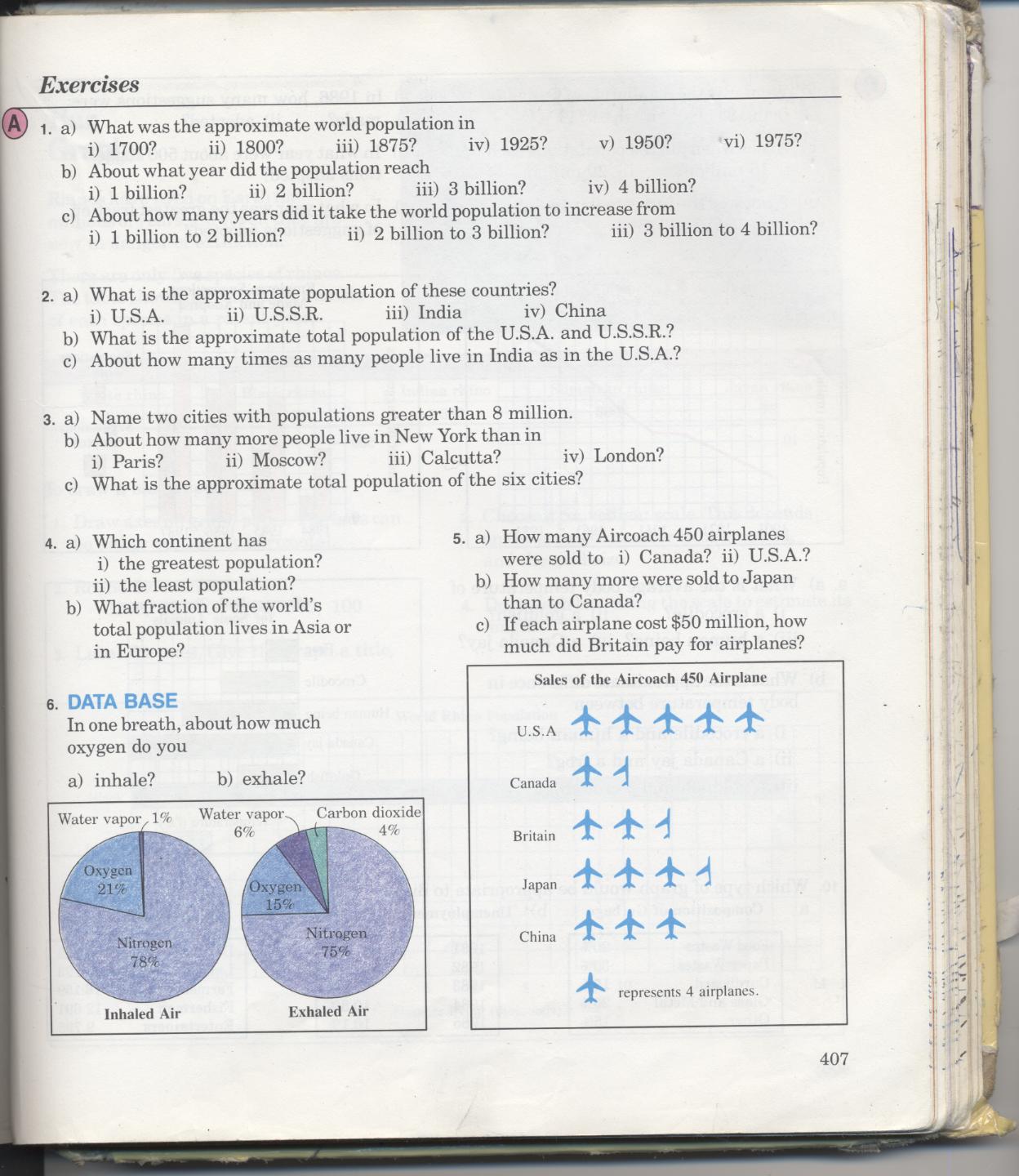
| obtaining_information_from_graph_part_1.jpg |
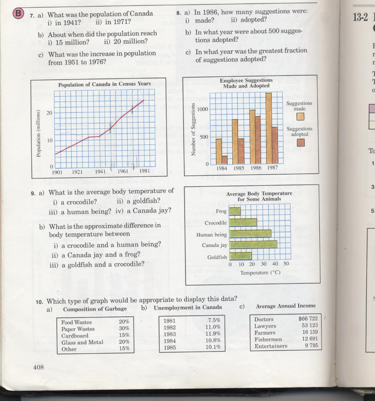
| obtaining_information_from_graph_part_2.jpg |
| obtaining_information_from_graph_part_3.jpg |
Complete activity sheets pages 407-408 #1-10
Due: Tuesday, October 4th
Due: Tuesday, October 4th
Day #2 ORGANIZING AND PRESENTING DATA
Reminders- Bar Graph - used to compare data
- Histogram - similar to bar graph, but have a range of data (bars touch each other)
- Line Graph - shows a trend/change over time (can be used to make a prediction)
- Scatterplot - considers relationship between two variables (not usually time)
- Pictograph - representation of data using visual symbols
- Circle Graph - is used when considering parts of a whole quantities involving percents
- Stem and Leaf Plot - is used when considering a single variable
Yesterdays lesson focussed on reading information from graphs created by someone else. Today the students were asked to make decisions as to which graphing format is most effective to present certain types of data. They were also expected to use the information from their created graphs to solve problems.
The following weblink provides information about three common types of graphs : 1) pie/circle graph 2) bar graph
3) line graph
With so much data and so many options, the question becomes, "WHICH TYPE OF GRAPH SHOULD I USE TO DISPLAY MY DATA?". Here are a couple of helpful videos to help to decipher which graph is appropriate for different data sets:
Day 3 EXPLORING SAMPLE SIZE

Different methods can be used for data collection. One of the major considerations is deciding whether to use the entire population or a sample. When the sample is small, it is most efficient and effective to use the entire population. When the population is large or hard to access, a sample can be used. There is potential for biased results whenever data is collected and used, but this bias (the distortion of statistical findings from the true value) increases greatly if the sample chosen is not large enough or is not representative of the population.
Today students were introduced to the concepts of samples and representative samples when conducting a survey.
Reminders
Census - a survey of all of the people within a population
Sample - a survey of part of a population that is used to make predictions about the whole population
Representative Sample - a survey from part of a population such that the properties of the sample reasonably reflect the properties of the entire population
The students followed the activity on taking a survey, recording the results and making predictions. They used the following chart to input the results of each of the subsequent samples:
As a followup, students were asked to complete the Reflection Questions #1-3 on page 97 of the textbook.
| exploring_sample_size.docx |
Day # 4 SCATTER PLOTS AND STEM AND LEAF PLOTS
Reminders - Scatterplot shows relationship between two variables
- a) Independent variable (variable not affected by the other) is plotted on the horizontal axis
- b) Dependent variable (variable affected by the other) is plotted on the vertical axis
- **When creating a scatter plot you must go up by a standard interval on both axes
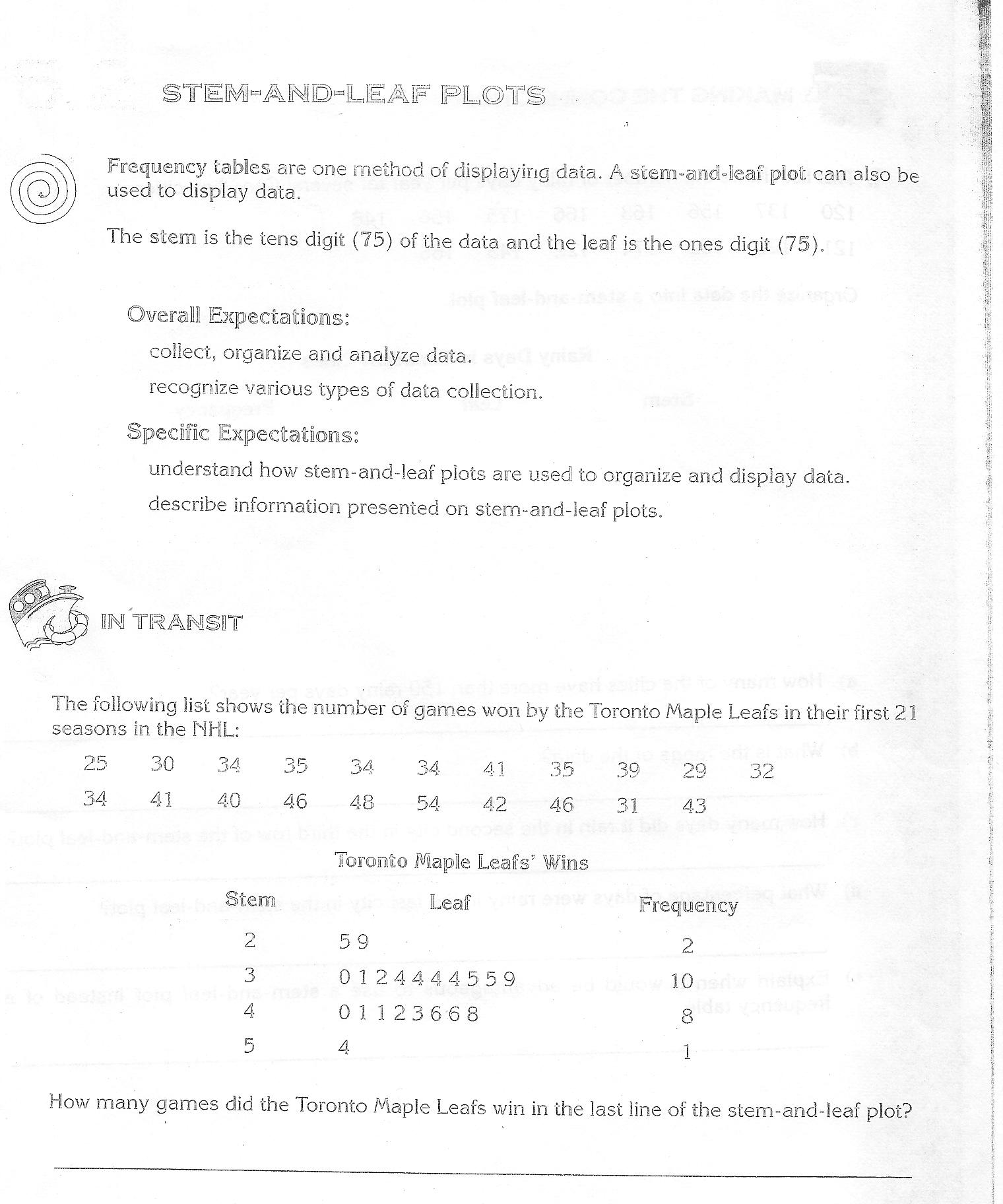
- Stem and Leaf Plot has a column of stems and leafs and is a compact way of writing a list of numbers
- Try this short quiz on recoginizing how to read stem and leaf plots: http://bit.ly/p51dlj For more information on how to draw and interpret stem and leaf plots check out this weblink: http://bit.ly/qnt6kk
- For 94, 97 and 99 the stem is 9 and the leaves are 4, 7, 9
The students were asked to complete an activity page on stem and leaf plots and the following questions from their textbooks: page 435-436 #1-6
| stem_and_leaf_plot_activity_sheet_1.jpg |
| stem_and_leaf_plot_activity_sheet_2.jpg |
Day 5 MID-CHAPTER REVIEW
Day 6 HISTOGRAMS
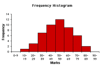
A histogram is a type of bar graph that shows how frequently data occurs within certain ranges or intervals. The height of each bar gives the frequency in the respective interval. Unlike a bar graph, the individual bars of a histogram touch each other and all of the bars are coloured the same hue.
Histograms show the frequency that data items occur within successive numerical intervals of equal size. In most histograms, the independent variableis plotted along the horizontal axis and the dependent variable is plotted along the vertical axis. The data appears as colored or shaded rectangles.
Constructing a histogram involves grouping the data into categories or intervals based on the frequency of the individual values within the data. This organization process usually occurs within a frequency table.
Day 7 MEASURES OF CENTRAL TENDENCY
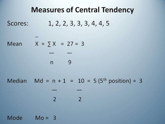
The arithmetic mean is the most common measure of central tendency. It simply the sum of the numbers divided by the number of numbers.
The median is also a frequently used measure of central tendency. The median is the midpoint of a distribution: the same number of scores are above the median as below it. When there is an odd number of numbers, the median is simply the middle number. For example, the median of 2, 4, and 7 is 4. When there is an even number of numbers, the median is the mean of the two middle numbers.
The mode is the most frequently occuring value in a data set.
Differences among the measures occur with skewed distributions. Skewed results occur in a data set when distorted or biased numbers show up in the set that greatly impact the measures of centrally tendency. For example, if one student in the class receives a mark of 30% on a test, but most of the students receive a mark of 75%, the entire mean score of the test for the class will be skewed negatively. The same can happen in the opposite direction with a positive skew.
Day 8 COMMUNICATING ABOUT GRAPHS
In this lesson, students will use the "Communication Checklist" to evaluate if the graphs they are looking at are appropriate for the information that is displayed; if the creator of the graph has made a convincing argument to support his/her conclusion; and to see if the sample size is truly representative of the population the graph intends to target or if there is some bias in the analysis.
Communication Checklist
- Did you check the scale?
- Did you include all of the data?
- Did you draw and label the graph correctly?
Day 9 CHAPTER REVIEW
In preparation for Monday's unit test, the students will complete a review of the concepts we have covered.
Day 10 UNIT TEST
